#fontsmatter: font trends in the B2B and B2C environment

Serifs, commons, swashes or ligatures are not necessarily familiar to everyone. Nevertheless, it is important to know how font trends, whether applied to your own corporate font or in the form of defining new fonts, achieve the desired effect. After all, even the best (advertising) message can be diminished by a boring visual presentation alone. This is why new and visually innovative approaches to typography are so particularly suitable for generating attention with words.
Why is it worth investing in typography?
Typography is much more than just a cool font. Used correctly, fonts can create effects, convey feelings and, above all, steal the show from images. Typography supports the identity of a company, can influence the meaning of words and entire contents and can contribute to creating effects in a targeted manner. Fonts can also be “charged” with values that are subconsciously communicated to the viewer.
If you want to use typography trends for yourself and your company, it is not always just a matter of changing the font. Rather, in this article we would like to show you how you can easily play with your own corporate typeface to make your corporate design even more interesting.
Trend #1: Italics
For a long time, the “italic” font style was ignored in design, if used at all to emphasize individual words. However, italics are now appearing more and more frequently and are used specifically as a design element. Whether as a header or for accentuated sections of text, italic typefaces add dynamism to any font.
Italic fonts are often used so skillfully that they merge with the text elements around them, even using bold print or underlining (as in the example above) to showcase the “italics” in the best possible way.


Trend #2: Bold Typography


Big ideas need big, concise letters. At least that's what this trend stands for in 2022. Block-like, thick fonts are increasingly catching the eye in graphic design. Massive, bold letters combined with interesting colors catch the eye and create creative compositions or can be used to create modern images even without an intense color scheme.
Bold typography also creates a special effect as the sole design element. As almost every font also has a particularly thick typeface, usually called “Extrabold” or “Black”, this trend can also be adapted to any existing corporate typeface.
„Typography is the craft of endowing human language with a durable visual form.”
----------------
Robert Bringhurst, ‘The Elements Of Typographic Style’.
Trend #3: Animated fonts

“With the help of animation, letters can be deformed in the most creative ways. The exciting thing about this trend is that illusions can be created and fonts can be brought to life.”
----------------
Sabine Karl, Sen. Communication Designerin
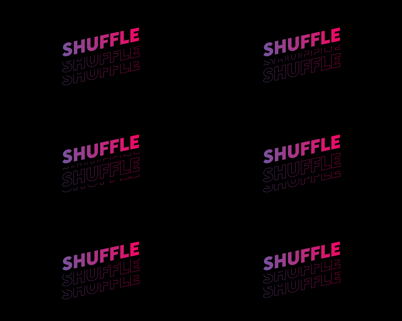
Our society is always on the move. The same applies to typography this year. From sparkles, enlargements, rotations or waves to 3D animations: Everything is possible.
Animated fonts can be used not only in web design. It is also particularly suitable for social media to bring short words or claims to life dynamically.
Trend #4: Experimenting with the font
Typography must be clear and legible, at least in theory. But this rule will also be broken in 2022. Experimentation with fonts is on the rise and is particularly popular in branding and packaging design.
Letters are primarily shapes. Experimental typography takes this idea and redefines it. And although it is often said that fonts need order and must follow certain guidelines, these rules are increasingly being pushed into the background - through visual forms, jumbled letters or obscuring and overlapping several characters.
“Experimenting with fonts can bring a new dimension to even the most established corporate typeface. It is often enough to arrange the letters more dynamically than the observer expects to create a modern and upbeat look!”
Dominik Hetzer, Communication Designer


Using the skills and facets of typography trends correctly

The way in which these trends are used can ultimately leave a lasting impression. Ideally, companies should choose the trend that best matches the chosen corporate design font. Modern typography truly offers more design potential than just choosing a simple font.
You can find out how to apply these trends and many more correctly, especially in the area of social media, in our webinar “Design in Social Media”, which takes place as part of our #MC23 Academy. Our senior communication designer Julia Leuenberger will show you why good design is particularly important on social media, how you can use design to increase your conversions and show your brand in the best light.
You can find more information and register here:
consult consult consult consult consult
Aktuelles Asset

Mit uns werden
ihre kampagnen zum vollen erfolg!
Sie haben eine exakte Vorgabe, wollen ausgewählte Unternehmen angehen & diese im Idealfall als Neukunden gewinnen? Erfahren Sie in unserem Factsheet, wie Sie mit Account-based Marketing-Kampagnen der Evernine Ihre Wunschzielgruppe ohne Streuverluste erfolgreich erreichen.
mehr erfahren